Last summer, I saw photographer Sebastião Salgado's long-term project, Genesis, on display at the Royal Ontario Museum in Toronto. I didn't originally plan on visiting the exhibit, but after seeing the first few images by the entrance to the gallery, I was hooked. To summarize what turned into hours of gallery-wandering, in short, the images blew me away.
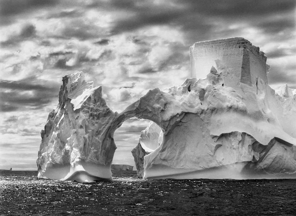 |
| Antarctic iceberg, from Genesis. |
Genesis took over 8 years to complete, and Salgado pulled out all of the stops. He traveled to Antarctica, Africa, Patagonia, Bhutan, the Galapagos Islands… his work captures nearly every corner of the Earth you knew about, and even some you didn't. It's comprehensive, it's beautiful, but most intriguing of all, every image from Genesis is in black and white. The exotic detail of Salgado's subjects were accentuated by the sharp contrast often seen in black and white imagery. Details pop out of images of all kinds, from wild, vast landscapes to close ups on animals and paint-covered tribes hidden deep within the jungles of South America.
 |
| Unknown South American tribe, from Genesis. |
I had never considered just how powerful black and white could be, especially for such a large scale, diverse endeavour. This exhibit really made me stop and think about how I could apply black and white images effectively in my own work.
 |
| Antarctic wildlife, from Genesis. |
But why go black and white?
- Keep your subjects looking classy and dramatic.
- Hide imperfections in your images.
- Creates a cohesive look for a collection of otherwise very different photos.
- No distracting colours (unless colour is what you're going for!).
 |
| South American tribes, from Genesis. |
You can learn more about Salgado and his work here.

Katie - these are such cool photos! Thanks for sharing. I totally agree with you: black and white photos have a certain quality to them. I googled some of his other images and I love the huge range of tones and shades in them, as well as the clarity of his subjects. I assume his photos have been worked with post shooting (I'm thinking about the image of the penguins and seals you posted) and the image looks so surreal partly because of the outlines on the subject matter, but the landscape in the background also brings a cool 'look' to the picture. I think this is a pretty cool example of how we can combine different types of photography and produce stunning images. It really shows how we have to pay attention to a variety of factors (lighting, subjects, composition, exposure, depth of field, ....).
ReplyDeleteHoly cow! Talk about some incredible places to shoot around the world, and some amazing images.. I am very jealous that you went to this gallery! Out of curiosity, how large were the prints? I can imagine them just being huge, as I think that the subject matter, crispness, and contrasts that are so well captured in his photos would look all the more jaw dropping. I completely agree with you both about how black and white has the power to really change the feel of a photo. You do well to point out a few of the possible reasons, Katie. One thing I would be curious to know is whether or not the photographer actually shoots his images in black and white in camera, or converts his color photos later in post production. Like Colin mentioned in class, I think that shooting in black and white before hand has the potential to really change how you approach a subject. I would also be curious to see what some of the artist's photos look like in color, just to see if the reaction you get from the photo would be different. Though this probably would not happen in real life, I think he should have two exhibits right next to each other that contain the same images, in the same order, in a similar space. The only difference is that one set is monochrome (like all his other work), and another set is in color. Do you think this would change how people would view and react to his work?
ReplyDeleteJordi, I wish you could have seen it too! It was an amazing experience. Many of the prints were probably in the 20x30 range, but there were others that–like you said–we just massive, I'd say some of the larger ones were about 2 or 3 ft by 3 or 4 ft. Absolutely stunning, especially with all of that detail! And you bring up a really good point about colour. I haven't read anything that says how he shoots the photos, but I'm pretty sure he uses a Canon EOS 5D (http://2yggwi3714jt19aodrvi700nhq.wpengine.netdna-cdn.com/wp-content/uploads/2013/08/escola-focus-fotografia-são-simbolos.jpg). I would love to see the kind of exhibits you've described… perhaps even make it into a social psychology experiment? You could have one set of visitors go through the black and white exhibit, and a different set could go through the colour one, survey them both, and then maybe we'll see which one is more effective! I totally think that it would change his work. Maybe the colours aren't as good where he shoots, which is why he goes black and white? Or perhaps they're overpowering and he's going for textures….
ReplyDeleteThese are beautiful! These photo made me think of the discussion we had at the end of class today, about editing after the photo is taken. I would be interested to know what processes he uses either in camera or post process manipulation to make these images to vibrant. This especially popped out to me in the photo of the Antarctic Wildlife. The coats of the seals (sea lions?) look so incredibly sharp and glistening! There is something about the sharpness and vibrance of the images that makes me wonder about his techniques. The fact that they are in black and white also speaks to our discussion, because if we are trying to capture something purely, perhaps we should not take them in black and white. It would be super interesting to compile some kind of book of different photographers opinions on these issues, and what they practice themselves.
ReplyDeleteThese are gorgeous pictures, I love the black and white. The details really seem to pop with the intense contrast. I wonder how much of the image was altered, it seems as though he bumped up the clarity on these images as well as a high contrast to make the textures show up intensely. Especially the one of the seals, which is an amazing picture, it gives the illusion that its not real.
ReplyDeleteThese pictures are all awesome. I especially love her ability to capture the various details and textures in all the scenes. My favourite shot is the one with the seals. It's a classing shot that use some of the elements we learnt in landscape photography (even though it's wildlife photography) with the subjects being in the foreground and the penguins lead your eyes into the background, super cool. In terms of Salgado using black and white, I think it's great. Personally I am a huge fan of monochrome because it forces us to focus on what is actually going on in the picture instead of looking at pretty colours. As a result, if used properly it can be super effective in telling certain stories or setting a certain mood.
ReplyDeleteThe last shot is straight out of Pans Labrinth...
ReplyDeleteIs the first one of the iceberg played with? Or is it just a wild shot that makes the ice look like it has a castle built on top of it...
I like the black and white tips. I find when the lighting isn't quite right or the colours are funky, you can usually save a shot by trying it in black and white.
I also find that you can take a photo of a person in colour, but you capture their soul in black and white.